pacman::p_load(corrplot, ggstatsplot, tidyverse)Hands-on Exercise 5 Appendix
Note: In Visual Correlation Analysis, this part of Visualising Correlation Matrix: ggcormat()cannot be shown. So I put it on a separate page to be able to display and practice this part of the visualization chart.
Visual Correlation Analysis
Installing and Launching R Packages
Importing Data
wine <- read_csv("data/wine_quality.csv")Visualising Correlation Matrix: ggcormat()
The basic plot
ggstatsplot::ggcorrmat(
  data = wine,
  cor.vars = 1:11)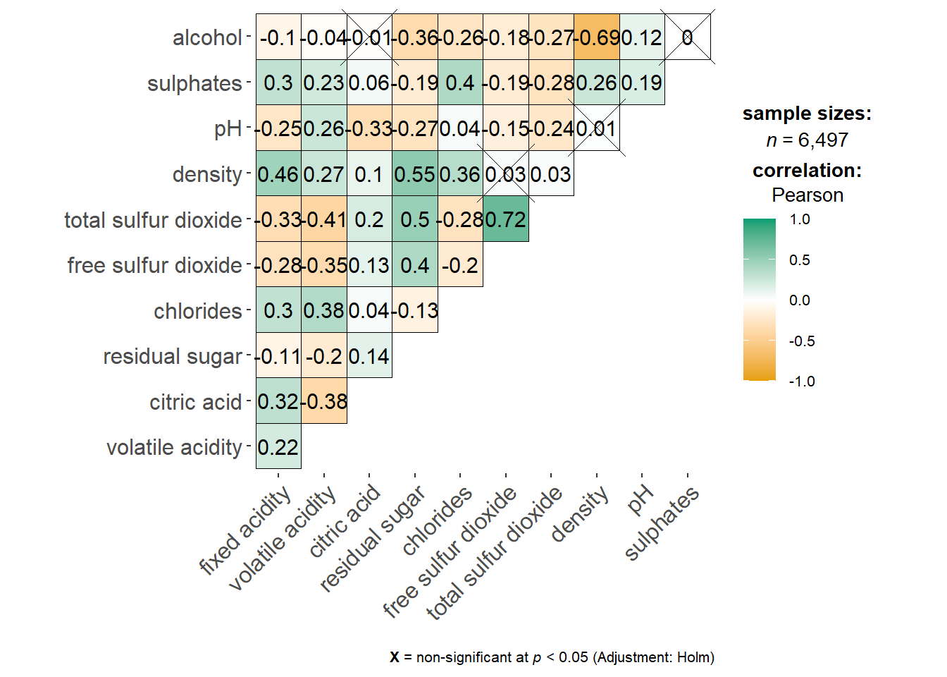
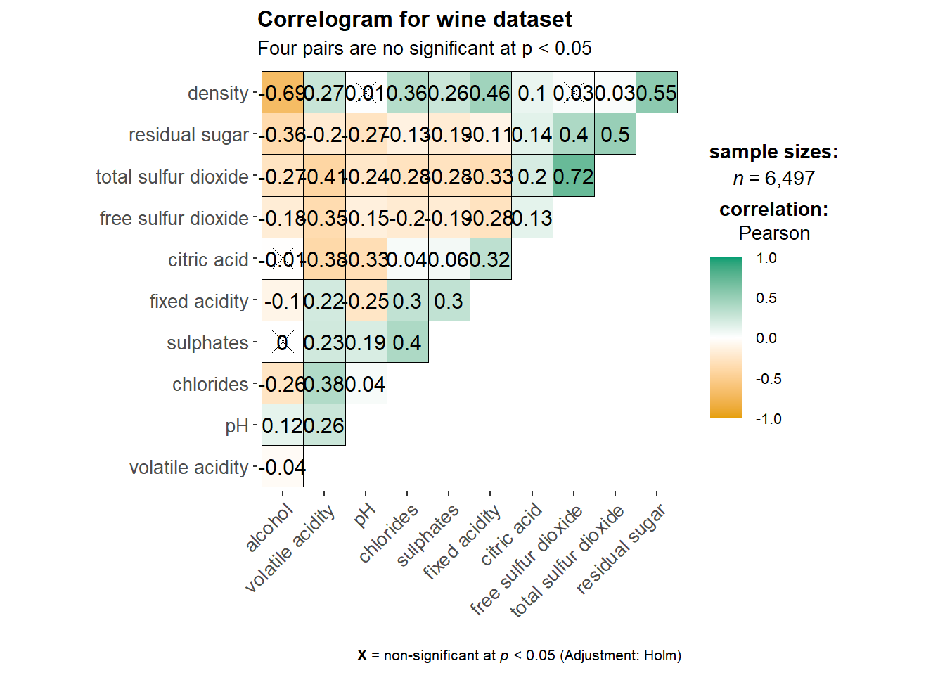
Show the code
ggstatsplot::ggcorrmat(
  data = wine,
  cor.vars = 1:11,
  ggcorrplot.args = list(outline.color = "black",
                         hc.order = TRUE,
                         tl.cex = 10),
  title    = "Correlogram for wine dataset",
  subtitle = "Four pairs are no significant at p < 0.05"
)
Show the code
ggplot.component = list(
    theme(text=element_text(size=2), #before size = 5
      axis.text.x = element_text(size = 8),
      axis.text.y = element_text(size = 8)))
Building multiple plots
Show the code
grouped_ggcorrmat(
  data = wine,
  cor.vars = 1:11,
  grouping.var = type,
  type = "robust",
  p.adjust.method = "holm",
  plotgrid.args = list(ncol = 2),
  ggcorrplot.args = list(outline.color = "black",
                         hc.order = TRUE,
                         tl.cex = 5, lab_size = 2), #before tl.cex = 10 and try to add lab_size = 2
  annotation.args = list(
    tag_levels = "a",
    title = "Correlogram for wine dataset",
    subtitle = "The measures are: alcohol, sulphates, fixed acidity, citric acid, chlorides, residual sugar, density, free sulfur dioxide and volatile acidity",
    caption = "Dataset: UCI Machine Learning Repository"
  )
)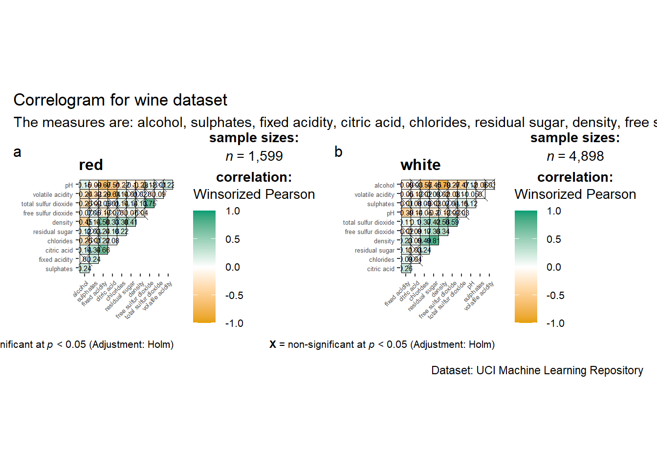
I tried to modify several sets of data, but the visualizations still presented problems.